The Screen We Stare At Most and Study Least: A Case for Lock Screen Research
An Interface Defined by Its Brevity
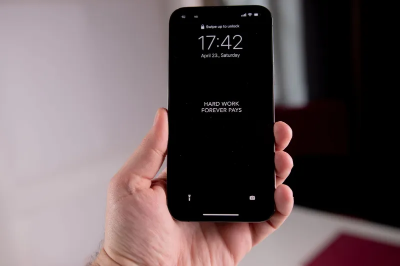
Consider the arithmetic. The average American checks their phone roughly 100 times a day, and a substantial share of those interactions begin and end on the lock screen—a two-to-five-second encounter with the time, a notification fragment, maybe a weather glyph. Multiply that out and the lock screen quietly accumulates more daily exposure than any single app, any television commercial break, any billboard on the I-95 corridor. It is, by contact hours, America's most viewed interface.
It is also, by academic measure, nearly unstudied. Glanceability—the science of what a human can extract from a display in under five seconds—has a respectable literature. Glance-based interaction research from the mid-2000s onward established clear principles: pre-attentive visual features are processed fastest, information density must collapse to essentials, and interruption costs compound. Almost none of this has been applied systematically to the lock screen.
Where the Platforms Fall Short
Measured against the attention literature, both major platforms underperform. iOS treats the lock screen as a staging area for notifications—a queue waiting to be processed—when glance research suggests users overwhelmingly want answers, not tasks. The time display dominates visual hierarchy despite being the least actionable element on screen. Android offers greater customization, including glanceable widgets, but buries it under settings complexity that guarantees most users never find it.
Worse, both platforms have recently added stimulation—always-on displays, live activities, lock screen widgets—without published evidence that these additions respect the interruption-cost findings that have been in the literature for two decades. We are running an uncontrolled experiment on a nation's attention.
What a Research-Grounded Lock Screen Would Look Like
Start with the glance budget. Five seconds, pre-attentive processing, one primary information object. The time and the single most contextually relevant item—next calendar event, not seventeen notification shards. Notifications should be summarized into meaning before they reach the lock screen, not rendered as raw sender lines. Ambient relevance should replace ambient noise: a lock screen that knows you are driving shows nothing you need to touch.
None of this requires new technology. It requires the industry to treat the lock screen as the consequential interface it demonstrably is, and to fund the research commensurate with its actual place in American life. Until then, the most-seen screen in the country will remain the least examined one—and we will all keep paying for it five seconds at a time.