Seventeen Years of Touch: How Academic HCI Research Quietly Built the Smartphone Interface You Use Every Day
When a user swipes upward on an iPhone to dismiss a notification, or stretches two fingers apart to zoom a map on a Samsung Galaxy, the gesture feels intuitive — almost obvious. That sense of obviousness is, in fact, the product of decades of rigorous inquiry conducted in university laboratories, conference proceedings, and peer-reviewed journals. The MobileHCI community, which convened its inaugural dedicated conference in 1998 and had already established a mature body of literature by 2007, played a foundational role in shaping the interaction paradigms that billions of people now navigate without a second thought.
This retrospective examines how the scholarly work presented at early MobileHCI gatherings anticipated — and in many documented cases directly informed — the commercial design decisions made by companies including Apple, Google, and Samsung. The story is not simply one of academic validation after the fact. It is a story of genuine intellectual precedence.
The Stylus Era and Its Discontents
In 2007, the dominant paradigm for mobile interaction was still largely stylus-mediated. Devices running Windows Mobile, Palm OS, and Symbian required users to tap small, precisely positioned interface elements with a pointed instrument. The ergonomic problems this created were well understood within the HCI research community years before mainstream consumers articulated them as frustrations.
Research presented at MobileHCI conferences throughout the early 2000s consistently identified the stylus as a friction point rather than a feature. Studies examining task completion rates, error frequencies, and user-reported fatigue demonstrated that requiring a secondary instrument to operate a device carried in a pocket introduced meaningful cognitive overhead. Users had to locate the stylus, grip it correctly, and modulate pressure — a sequence of micro-decisions that accumulated into measurable inefficiency over the course of a day.
Perhaps more consequentially, researchers began examining what happened when users attempted to operate mobile devices with their fingers rather than the prescribed stylus. These investigations were not purely exploratory. They were motivated by a theoretical premise, already circulating in the literature by 2004, that the most successful mobile interface would be one that required no instrument beyond the human hand itself.
Thumb Zones and the Geometry of One-Handed Use
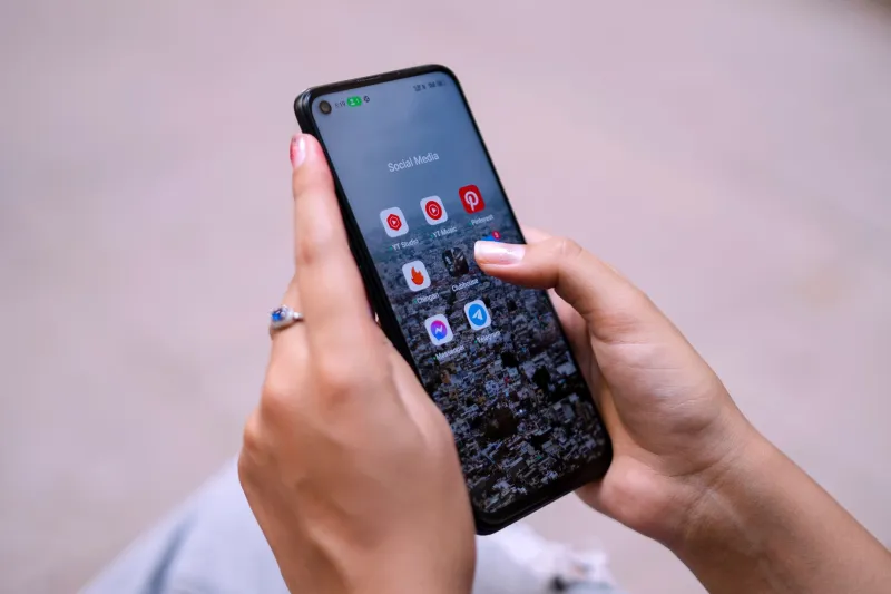
One of the most durable contributions of early mobile HCI scholarship is the systematic analysis of thumb reach and reachability zones on handheld devices. Researchers studying one-handed phone operation — a behavior that observational studies confirmed was overwhelmingly common among American users, particularly during commuting and other transit contexts — produced detailed spatial maps of which screen regions a thumb could access comfortably, which required awkward extension, and which were effectively unreachable without repositioning the device.
These findings, which circulated in conference proceedings well before 2007, established a vocabulary that product designers would later adopt wholesale. The concept of the "thumb zone" — a roughly arc-shaped region in the lower-center and lower-dominant-side of a screen — became a foundational heuristic in mobile UI design. Navigation elements, primary action buttons, and frequently accessed controls migrated toward this zone in successive generations of mobile operating systems.
The implications extended beyond button placement. Research into one-handed use also identified that users were reluctant to shift grip mid-task, meaning that interface flows requiring input from screen regions outside the comfortable thumb arc introduced measurable abandonment risk. This finding had direct implications for the architecture of mobile forms, checkout flows, and in-app navigation — implications that Google's Material Design guidelines and Apple's Human Interface Guidelines would eventually codify, though not always with explicit citation of the underlying scholarship.
From Tap Targets to Touch Affordances
The transition from stylus to finger as the primary input modality required a fundamental reconceptualization of what constituted an adequately sized interactive element. A stylus tip, precisely controlled, could reliably activate a target as small as four pixels square. A fingertip, by contrast, occludes a surface area roughly ten to fifteen millimeters in diameter and introduces targeting imprecision that stylus interaction simply does not.
Mobile HCI researchers addressed this problem through systematic empirical study. Controlled experiments measuring tap accuracy across varying target sizes, spacing configurations, and user populations produced clear quantitative recommendations. The consensus that emerged — target sizes should meet a minimum of approximately 44 pixels at standard display densities, with adequate spacing between adjacent interactive elements — was not an arbitrary figure. It was a statistically grounded threshold derived from error rate data.
Apple's 2007 Human Interface Guidelines for iPhone specified a minimum tap target size of 44 by 44 points. Google's Android guidelines converged on similar recommendations. Both figures align with the empirical findings that had been accumulating in the mobile HCI literature for the preceding several years. Whether these specifications were derived directly from academic sources or arrived at through parallel internal research, the numerical convergence is striking and difficult to attribute to coincidence.
Edge-to-Edge Displays and the New Reachability Problem
The subsequent decade introduced a new set of ergonomic challenges that the 2007-era research community had partially anticipated. As manufacturers pursued ever-larger display surfaces — driven by consumer preference data showing that Americans consistently rated screen size as a primary purchase consideration — the comfortable thumb zone shrank as a proportion of total screen area.
The reachability problem that researchers had documented on 3.5-inch displays became substantially more acute on the 6.7-inch panels now standard in flagship devices. Apple's response, the "Reachability" feature introduced in iOS 8, which temporarily shifts the upper half of the display downward upon a double-tap of the home button, is a direct acknowledgment of the ergonomic constraint that HCI scholarship had been describing for years.
Gesture navigation, which replaced button-based navigation across major mobile platforms between 2017 and 2020, introduced additional complexity. Swipe gestures originating from screen edges — used to navigate backward, access the home screen, or invoke multitasking — require users to initiate input at precisely the locations that the thumb zone research had identified as least comfortable for extended-arm reach. The tension between display size preferences and ergonomic constraints remains an active area of investigation within the mobile HCI community.
The Translation Gap Between Research and Practice
A candid retrospective must acknowledge that the relationship between academic HCI research and commercial product development has not always been direct or efficient. The translation of peer-reviewed findings into shipping features frequently involves considerable delay, organizational friction, and selective interpretation. Findings that complicate commercially desirable design patterns — for instance, research suggesting that notification frequency has measurable negative effects on task performance — have not always received the same enthusiastic adoption as findings that validate intuitive ergonomic improvements.
Nevertheless, the intellectual debt that contemporary mobile interface design owes to the MobileHCI research community is substantial and documentable. The principles that govern tap target sizing, navigation placement, gesture vocabulary, and one-handed interaction patterns were not invented by product designers working from intuition. They were established through controlled experimentation, peer review, and scholarly publication — a process that the MobileHCI conference series has supported and advanced since its earliest iterations.
As mobile displays continue to evolve — toward foldable form factors, ambient wearable surfaces, and augmented reality overlays — the research questions that occupied the 2007 conference program will find new expressions. The methodological frameworks developed to study thumb zones and tap targets will require adaptation, but the underlying commitment to empirical rigor in the service of human-centered design remains the field's most enduring contribution.