Seven Deceptive Patterns HCI Already Named, and the Field Audit That Catches Them
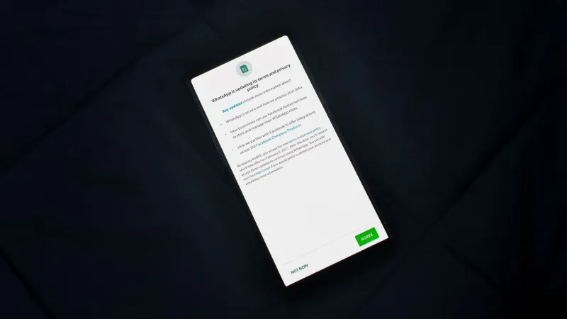
Deceptive interface design is not a recent invention, and it is not a mystery. The academic vocabulary for it is more than a decade old, the pattern taxonomies have been published and replicated, and the mechanisms have been traced back to well-understood findings about attention, default bias, and the cost of reversing a decision. What has changed is the stakes: enforcement actions, state attorneys general, and platform review policies now treat interface design as a matter of consumer protection rather than a matter of taste.
What follows is a working catalog for product and design teams in the United States. Each entry names a tactic, identifies the research tradition that describes it, and explains why it works on the human being holding the phone. The list is not exhaustive, and the ordering is not a ranking of severity. It is a starting vocabulary for a conversation that most mobile organizations still have only after something has gone wrong.
1. Confirmshaming
The tactic: the decline option is written to insult the user, as in a button reading something like a refusal to improve one's own life, health, or financial standing.
The research lineage: work on persuasive computing and on the emotional framing of choice laid out how affective language alters compliance rates, particularly in low-attention contexts. The mechanism is simple. The user wants to avoid a small social sting, and the cost of avoidance is one tap.
Why it survives: it is cheap to write, hard to measure against a counterfactual, and rarely caught in time.
2. Obstruction at the Exit
The tactic: the flow that signs a user up takes four taps, and the flow that cancels takes four screens, one of which fails to load on a cellular connection.
The research lineage: the asymmetric-friction family of patterns, often described as the roach motel in the practitioner canon and formalized in later design research taxonomies as obstruction. The relevant HCI insight is that effort is a legitimate design material, and that increasing effort at a decision point is indistinguishable, from the user's perspective, from removing the option.
Why it survives: retention is reported monthly, and the friction sits inside a funnel that few teams instrument end to end.
3. Disguised Advertising
The tactic: an ad rendered so closely in the visual language of native content that the user cannot tell, at a glance, that it is paid.
The research lineage: studies of visual hierarchy, ad recognition, and noticeability on small screens consistently show that salience cues rather than labels drive recognition. A label in the corner satisfies a disclosure requirement and fails the recognition test.
Why it survives: engagement metrics reward the ambiguity, and the harm falls on the advertiser's brand as much as the publisher's.
4. Bundled Consent
The tactic: the privacy choice is welded to the service choice, so that declining tracking means declining the feature, the discount, or access entirely.
The research lineage: usable-privacy research on consent bundling and on the illusion of meaningful choice. When refusal has a punitive consequence, the interface has stopped asking and started pricing.
Why it survives: legal review reads the disclosure, not the flow.
5. Nagging
The tactic: the same request returns at increasing frequency, with a smaller dismiss control each time.
The research lineage: interruption research, which established that repeated interruptions degrade task performance well beyond the cost of the interruptions themselves, and that the annoyance compounds even when the user ultimately complies. Compliance is not a success metric here. Resentment is a leading indicator of churn.
Why it survives: the denominator is dismissal rate rather than user sentiment.
6. Manufactured Urgency
The tactic: a countdown timer, a stock counter, or a scarcity badge attached to an offer that will be identical tomorrow.
The research lineage: scarcity and time pressure as compliance levers are among the best-documented effects in behavioral decision research, and the mobile context magnifies them because the decision is compressed into seconds on a small screen. Fabricating the pressure converts a legitimate principle into a lie about the state of the world.
Why it survives: it is treated as marketing copy rather than as an interface claim subject to verification.
7. Preselected Misdirection
The tactic: checkboxes pre-ticked in the company's favor, toggle states whose visual emphasis contradicts their actual state, and confirmation dialogs whose primary button performs the action the user did not want.
The research lineage: defaults research is one of the most reliable findings in the field, which is precisely why weaponized defaults are so effective. The user's cognitive budget at the moment of confirmation is small, and the interface spends it for them.
Why it survives: the path of least resistance is misread as the path of preference.
Where Naming Gets You
A taxonomy is a diagnostic instrument, not a remedy. Organizations that have adopted these vocabularies frequently discover that the hardest part of removing a deceptive pattern is not recognizing it but unwinding the metric that depends on it. A confirmation rate, an opt-in share, a cancellation-avoidance figure: each of these can be traced to a specific interface decision whose removal will move a dashboard that someone is evaluated on. Naming the pattern starts the argument. It rarely ends it.
Nor should the catalog be used as a cudgel. Some of these tactics arise from inattention rather than intent, and treating every ambiguous button as an act of malice produces defensiveness rather than change. The productive framing is procedural: make the question routine, ask it before launch, and give someone the standing to block.
The Field Audit
Run this against any flow that asks the user to do something, especially one that asks them to consent, subscribe, or stay.
- Read the decline option aloud. Would a colleague be comfortable hearing it described to a customer?
- Count the taps. Compare the effort required to enter a commitment with the effort required to leave it. If the asymmetry exceeds a small factor, justify it in writing.
- Remove the label from every advertisement and show the screen to five people. If they cannot identify the paid content, the disclosure has failed.
- Disconnect the privacy choice from the service choice. If the feature no longer works, say so plainly at the point of decision rather than after it.
- Log every interruption. Count how many times the same request is issued in a thirty-day window, and review the count against the value delivered.
- Verify every urgency claim against a source of truth. If the timer resets, it is not a timer.
- Check every default. For each pre-set option, write down who benefits from the user not touching it.
- Instrument the exit. Measure cancellation completion, cancellation abandonment, and support contacts attributable to the exit flow, and report them alongside acquisition.
The checklist will not make an organization honest on its own. It will, however, make dishonesty harder to accomplish by accident, and that is where most of it happens. The research community named these patterns years ago because they were legible in the data. The remaining work is operational, and it belongs to the teams who ship the screens.