Familiarity Is Not Intuition: What Semiotic Research Reveals About the Persistent Failure of Mobile Iconography
There is a quietly persistent assumption embedded in the workflow of nearly every mobile product team in the United States: that a well-crafted icon communicates its function transparently, without instruction, to any user who encounters it. This assumption is not merely optimistic. According to a substantial body of research in mobile semiotics and visual cognition, it is empirically wrong — and the consequences for inclusive design are significant.
The distinction between familiarity and intuition is not a philosophical nicety. It is a measurable, reproducible difference that researchers have been documenting for well over two decades. Yet the mobile industry has, with remarkable consistency, treated icon recognition rates among experienced users as evidence that its visual symbols are inherently legible. The scholarly literature tells a different story.
The Semiotic Foundation the Industry Ignored
The academic study of iconography draws heavily from the semiotic tradition established by Charles Sanders Peirce and later developed through applied visual cognition research. Peirce's tripartite model — distinguishing icons (where the sign resembles its referent), indices (where the sign points to its referent), and symbols (where the relationship is entirely arbitrary and learned) — provides a precise framework for diagnosing why mobile interface glyphs so frequently fail new users.
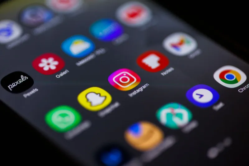
The critical insight is that most elements of a mobile interface that designers call "icons" are, in Peirce's taxonomy, actually symbols. The hamburger menu does not resemble a navigation drawer. The magnifying glass carries no inherent connection to the act of searching. The floppy disk — still appearing in productivity applications used by Americans who have never owned one — is a pure cultural artifact, meaningful only to those who lived through a particular era of computing history.
Research published across multiple HCI venues has repeatedly confirmed that first-time smartphone users and individuals transitioning between platforms demonstrate icon comprehension rates that are, in some studies, scarcely better than chance for unfamiliar symbol sets. A 2003 study by Leung and colleagues, examining icon recognition across different cultural and age groups, found that comprehension rates for abstract interface symbols dropped sharply when participants lacked prior exposure to the specific platform in question. The icons were not intuitive. They were merely familiar — to someone else.
The Comprehension Gap Across User Populations
This distinction carries particular weight in the context of the contemporary American mobile market. The United States presents a user population of extraordinary diversity: across age, educational background, prior technology exposure, and the specific platform ecosystems individuals have historically inhabited. A symbol set calibrated to the experiential vocabulary of a 28-year-old iOS user in San Francisco will not self-evidently communicate to a 62-year-old Android adopter in rural Ohio, or to a recent immigrant navigating an American smartphone for the first time.
Research in cross-cultural semiotics has further demonstrated that the assumed universality of many mobile icons is a projection of the cultural context in which they were designed. The "home" icon — a pitched roof above a square — carries architectural connotations that are not globally shared. The envelope as a metaphor for electronic messaging is increasingly opaque to younger users who have never associated physical mail with primary communication. These are not edge cases. They represent the predictable failure modes of a design process that substitutes aesthetic refinement for empirical validation.
Studies examining elderly first-time smartphone adopters in the US have been particularly instructive. Research from the early 2000s documented consistent patterns of icon misinterpretation not attributable to cognitive decline but to the simple absence of a shared visual vocabulary. The icons were polished. They were consistent. They communicated fluently — but only to users already fluent in the language they spoke.
Why the Industry Conflated the Two
Understanding how this conflation took hold requires examining the feedback loops that govern mobile product development. Usability testing, when conducted at all, is typically performed with participants recruited from existing user bases. These individuals have already internalized the platform's symbolic conventions. Their high icon recognition rates are then interpreted as evidence of inherent legibility rather than as a measurement of successful prior acculturation.
This methodological blind spot is compounded by the professional context in which designers operate. Teams building mobile interfaces are, almost by definition, among the most technologically experienced users in the country. Their intuitions about what a given symbol communicates are shaped by years of immersion in the very visual vocabularies they are designing within. The icon that seems obvious to a product designer at a major tech firm may be entirely opaque to the new smartphone owner who just walked out of a carrier store in suburban Ohio.
The academic literature has a precise term for this cognitive failure: the curse of knowledge. Once a person has internalized a symbol system, it becomes genuinely difficult to recover the experience of encountering it without that prior knowledge. Designing for legibility thus requires not better intuition, but better methodology — specifically, structured empirical testing with representative naive users.
The Case for Evidence-Based Symbolic Testing
Several researchers have proposed frameworks for integrating semiotic validation into the standard mobile product development pipeline. Icon comprehension testing — presenting symbols without accompanying text labels to participants who have not used the product — is among the most straightforward interventions available. Its consistent absence from standard practice is not a technical obstacle. It is a prioritization failure.
Moreover, the research community has developed increasingly sophisticated methods for assessing icon legibility across diverse populations. Card sorting studies, semantic differential scales, and think-aloud protocols applied to symbol interpretation tasks have all demonstrated utility in identifying comprehension failures before products reach market. The tools exist. The evidence base exists. What has been lacking is the institutional pressure to apply them.
For the US mobile development community, the argument for mandatory symbolic testing is not merely one of scholarly completeness. It is a practical and ethical imperative. As smartphones become the primary interface through which Americans access healthcare information, government services, financial tools, and emergency communications, the consequences of iconographic failure are no longer confined to user frustration. They extend to genuine exclusion.
Toward a More Honest Account of Visual Communication
The mobile interface research community has long understood what the broader industry has been slow to accept: that the apparent clarity of an icon library is, in most cases, a measure of how successfully a platform has trained its existing users — not of how transparently its symbols communicate to the uninitiated.
Acknowledging this distinction does not require abandoning visual iconography as a design tool. Icons serve real functions in dense mobile interfaces where screen real estate is constrained and text labels create visual noise. But the design of those icons cannot proceed responsibly on the basis of aesthetic consensus among experienced practitioners. It must be grounded in empirical evidence drawn from the full range of users the product will actually serve.
The polished icon library is not a solved problem. It is, at best, a well-executed hypothesis — one that the research record consistently suggests deserves more rigorous testing than it typically receives.