Designed for Nobody: How Mobile App Architecture Fails the Fractured Attention of Real American Users

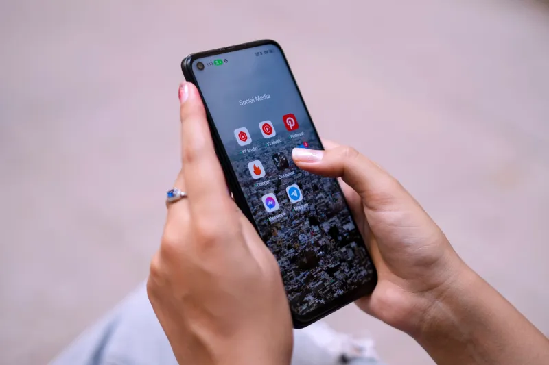
Consider the following scenario, which is not hypothetical. A commuter standing on a platform at Chicago's O'Hare Blue Line station unlocks her phone with approximately ninety seconds before her train arrives. She opens a banking application to check whether a pending deposit has cleared. The app loads a dashboard optimized for desktop-era financial management workflows — account summaries, promotional offers, navigation menus organized around product categories rather than task urgency. She finds the information she needs in forty seconds, locks her phone, and boards the train.
She completed her task. By conventional usability metrics, the interaction was a success. By the standards emerging from HCI research on micro-session behavior, it was a near-failure that succeeded only because her specific need happened to be simple enough to satisfy despite the application's structural indifference to her context.
For users with more complex needs, or less time, the outcome is frequently worse.
What the Research Actually Shows
The academic literature on mobile usage patterns has produced findings that are, in aggregate, fairly damning of current app design conventions. Studies examining how Americans interact with mobile applications in naturalistic settings — as opposed to laboratory conditions that provide participants with uninterrupted time and full cognitive availability — consistently document interaction sessions that are dramatically shorter, more fragmented, and more cognitively encumbered than the sessions most app interfaces appear to anticipate.
Research on session duration has found that a substantial proportion of mobile application interactions last under two minutes, with a significant cluster in the thirty-to-ninety-second range. These are not failed interactions — they are, in many cases, precisely the interaction the user intended. The user had a specific, bounded task: check a balance, confirm an address, read a single message. They completed it and stopped.
The problem is that most application architectures were not designed with these sessions in mind. They were designed — implicitly, and in many cases explicitly — for what researchers sometimes describe as the "desktop transplant" model: an interaction paradigm carried over from personal computer software, where users were assumed to arrive at an application with extended time, stable attention, and a willingness to navigate hierarchical information structures.
Cognitive Load in Constrained Contexts
The cognitive load implications of this mismatch are well-documented and worth stating plainly. When a user arrives at an application in a high-interruption environment — a drive-through lane, a waiting room, a sidewalk in midtown Manhattan — their available working memory is already partially occupied by environmental demands. They are monitoring ambient noise, maintaining spatial awareness, managing social context. The cognitive budget available for application navigation is genuinely reduced.
HCI research on dual-task performance in mobile contexts has demonstrated that this reduction is not trivial. Users in high-distraction environments make more navigation errors, abandon tasks at higher rates, and report lower satisfaction with interactions that they might have found entirely acceptable in a low-distraction setting. The application has not changed. The user has not changed. The context has changed, and the application has no mechanism for responding to it.
This is what makes the micro-session problem distinct from a general argument about simplicity in interface design. It is not that mobile applications are too complex in absolute terms — some tasks genuinely require complex interfaces. It is that most applications present their full complexity regardless of the user's contextual capacity to engage with it.
Task Resumption and the Underappreciated Cost of Interruption
Research on task resumption — what happens when a user's interaction is interrupted and they attempt to return to it — adds another dimension to this critique. Interruptions during mobile application use are not exceptional events. They are, for a large proportion of American mobile users, the default condition. Phone calls arrive. Children ask questions. Traffic lights change.
Studies examining task resumption in mobile contexts have found that users frequently cannot accurately reconstruct their position in a multi-step workflow after even a brief interruption. This is not a failure of user competence — it is a predictable consequence of how working memory functions under interruption. The application, however, typically provides no scaffolding to support resumption: no indication of where the user was, no summary of choices already made, no pathway back to the relevant decision point that does not require retracing earlier steps.
The cost of this design gap is borne entirely by the user, and it falls disproportionately on users who are most likely to experience interruptions — which is to say, users with demanding professional or caregiving responsibilities, users in high-density urban environments, and users who are, in short, most representative of the actual American mobile user population.
Glanceability as a Research Priority
The concept of glanceability — the degree to which an interface can communicate essential information in a single, brief visual encounter — has received meaningful attention in the HCI research community, though its influence on production application design has been uneven at best.
Research on glanceability has established that it is not simply a matter of reducing visual clutter, though that is a component. Genuinely glanceable interfaces are structured around what researchers describe as "information hierarchy aligned with task urgency" — the most time-sensitive or frequently needed information is positioned and formatted so that it requires the least possible visual processing to locate and interpret. This is architecturally different from conventional dashboard design, which typically organizes information around product or feature categories rather than user task frequency.
The smartwatch interface research that has emerged in recent years offers some instructive models, precisely because the severe screen real estate constraints of wearable devices forced designers to confront glanceability as a first-order problem rather than an optimization. Some of the design solutions developed in that context — persistent summary states, time-aware information prioritization, single-action task completion — translate meaningfully to smartphone application design, though the translation has been slow.
Principles the Research Supports
Synthesizing across the literature on micro-session behavior, cognitive load, task resumption, and glanceability, several design principles emerge with reasonable consistency.
Applications should maintain and surface a persistent state summary that allows users to reorient immediately after interruption without retracing their steps. Navigation hierarchies should be organized around task frequency and urgency rather than feature completeness. Critical information — account status, confirmation states, time-sensitive alerts — should be accessible within a single interaction step from the application's entry point. Workflows that cannot be completed in a single micro-session should include explicit save states and resumption cues.
None of these principles are technically challenging to implement. They require a shift in design priorities, not a breakthrough in engineering capability. The barrier is largely conceptual: it requires accepting that the idealized, attentive user for whom most applications are implicitly designed is not the user who actually exists.
The Accountability the Field Must Demand
The HCI research community has produced the evidence. The patterns of real-world mobile use in the United States are documented, replicated, and available in the published literature. What remains is the harder work of translating that evidence into professional practice — of holding the design community accountable to findings that complicate the convenient fiction of the uninterrupted user.
The commuter on the platform deserves better than an application that treats her ninety-second window as an edge case. She is not the edge case. She is the user.